Tater Time is a celebration of comfort, simplicity, and honest flavor. Inspired by the humble charm of home-baked jacket potatoes, the brand brings this classic comfort food back into the spotlight. Crispy on the outside, fluffy inside, and always generously topped. At Tater Time, every bite is a warm reminder of the joy in simple things, served with heart and zero fuss. It’s real food, done right, where the potato takes center stage, and comfort is always on the menu.
Tater Time, c’est la célébration du réconfort, de la simplicité et du vrai goût.
Inspirée du charme authentique des pommes de terre au four faites maison, la marque remet ce grand classique au centre de la table. Dorées et croustillantes à l’extérieur, moelleuses à cœur, toujours généreusement garnies.
Inspirée du charme authentique des pommes de terre au four faites maison, la marque remet ce grand classique au centre de la table. Dorées et croustillantes à l’extérieur, moelleuses à cœur, toujours généreusement garnies.
Chez Tater Time, chaque bouchée rappelle le bonheur des choses simples, servies avec chaleur et sans chichis.
Ici, c’est la pomme de terre la star, pour une cuisine sincère où le réconfort est toujours au menu.
Ici, c’est la pomme de terre la star, pour une cuisine sincère où le réconfort est toujours au menu.


Main Color: warm, vibrant orange
The bold orange background is an immediate signal of warmth, energy, and appetite. It's inviting and playful, the perfect tone for a comfort food brand. This orange evokes the cozy heat of an oven-baked potato and draws attention in a cheerful, unpretentious way.
Couleur principale : un orange chaud et vibrant
Ce fond orange affirmé transmet instantanément chaleur, énergie et appétit. À la fois accueillant et ludique, il incarne parfaitement l’esprit d’une marque dédiée au confort food. Cet orange rappelle la chaleur réconfortante d’une pomme de terre tout juste sortie du four, et attire le regard de façon joyeuse.
Ce fond orange affirmé transmet instantanément chaleur, énergie et appétit. À la fois accueillant et ludique, il incarne parfaitement l’esprit d’une marque dédiée au confort food. Cet orange rappelle la chaleur réconfortante d’une pomme de terre tout juste sortie du four, et attire le regard de façon joyeuse.
Typography: round, friendly, and bold
The white, chunky, rounded font feels approachable and fun. It gives off a welcoming, homemade vibe that perfectly matches the spirit of the brand. Simple pleasures, served with a smile. There’s no formality here, just good food and good energy.
Typographie : ronde, conviviale et affirmée
Cette police, épaisse et arrondie dégage une impression de proximité et de bonne humeur. Elle transmet une atmosphère accueillante et artisanale qui correspond parfaitement à l’esprit de la marque. Des plaisirs simples, servis avec le sourire. Ici, pas de formalisme : juste de la bonne cuisine et une énergie positive.
Cette police, épaisse et arrondie dégage une impression de proximité et de bonne humeur. Elle transmet une atmosphère accueillante et artisanale qui correspond parfaitement à l’esprit de la marque. Des plaisirs simples, servis avec le sourire. Ici, pas de formalisme : juste de la bonne cuisine et une énergie positive.
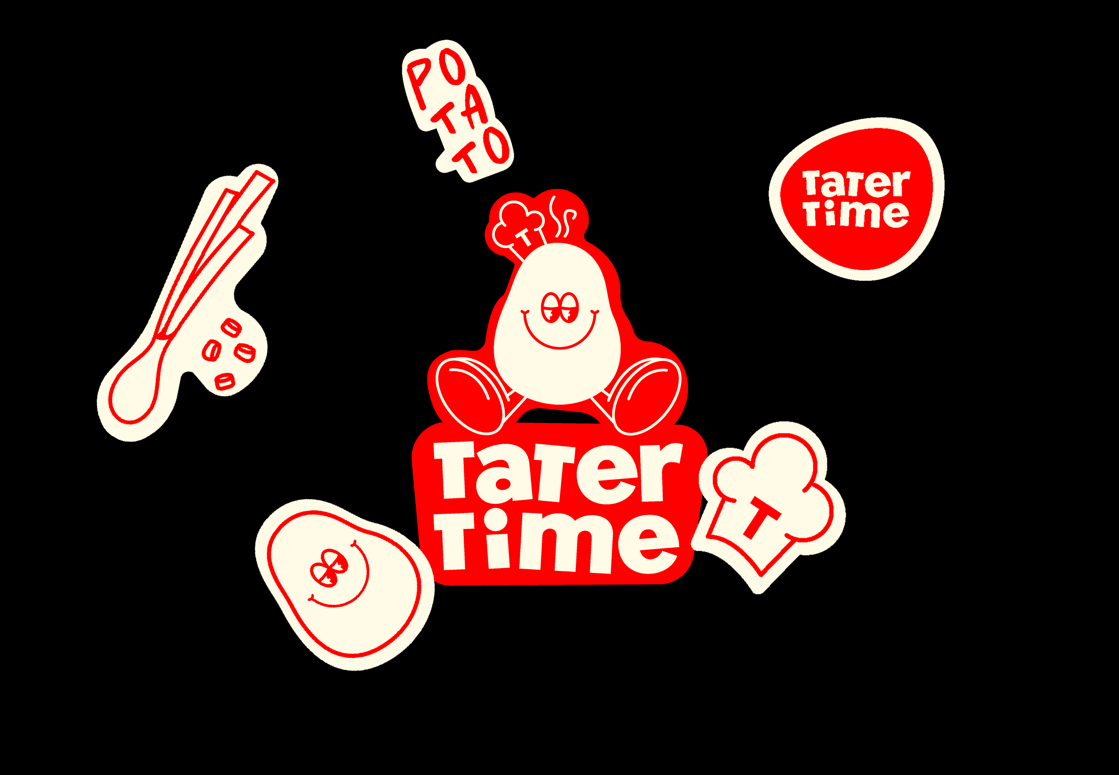
Mascot: The Happy Potato
At the heart of the brand is a joyful potato character. Illustrated with a big smile, a chef’s hat, and playful limbs. This mascot embodies:
- Fun and friendliness, with its cheerful expression,
- Homemade quality, shown through the chef’s hat,
- Wholesome indulgence, keeping things simple and relatable.
It personifies the idea that the potato is not just an ingredient, it's the hero of the dish, full of personality and comfort.
Mascotte : La Pomme de Terre Heureuse
Au cœur de la marque se trouve un personnage joyeux en forme de pomme de terre. Illustré avec un grand sourire, une toque de chef et des petits bras et jambes pleins de malice. Cette mascotte incarne :
Au cœur de la marque se trouve un personnage joyeux en forme de pomme de terre. Illustré avec un grand sourire, une toque de chef et des petits bras et jambes pleins de malice. Cette mascotte incarne :
- La bonne humeur et la convivialité, grâce à son expression joyeuse,
- Le fait-maison, symbolisé par la toque de chef,
- La gourmandise simple et accessible, qui parle à tout le monde.
Elle personnifie l’idée que la pomme de terre n’est pas qu’un simple ingrédient : c’est la véritable héroïne du plat, pleine de personnalité et de réconfort.